A question I'm often asked - especially by younger readers - is "How did you do the cover?"
The truth is that very few writers create the covers for their own books. See, any good publishing company knows that the purpose of the cover is to catch the eye of the readers. This is particularly important for a book written by someone who's not very well known. The cover is the book's strongest point of advertising: there are plenty of cases where an unsuccessful book has been re-printed with a different cover and gone on to do extremely well.
For The Quantum Prophecy, work on the cover began even before the book was finished! Now, even though I said very few writers create the covers for their own books, I did have a stab at it myself...
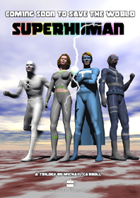 My original title for the series was Hero, but we had to drop that idea because a movie was released
with the same name. So I decided that I liked Superhuman for the series title, and I created
the cover you can see on the right. These are early versions of the older superhero characters; check the
Features page for the more recent versions!
My original title for the series was Hero, but we had to drop that idea because a movie was released
with the same name. So I decided that I liked Superhuman for the series title, and I created
the cover you can see on the right. These are early versions of the older superhero characters; check the
Features page for the more recent versions!
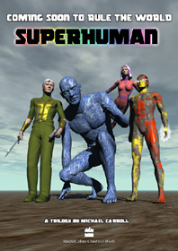 And just for fun, I also created this variation...! From left to right, we have the bad guys:
Ragnarök, Brawn, Slaughter and Dioxin.
And just for fun, I also created this variation...! From left to right, we have the bad guys:
Ragnarök, Brawn, Slaughter and Dioxin.
You'll notice that the "shoutline" above the title is a little different in this one!
But these images were just for fun, and were never intended to be the final cover: for one thing, they focus on minor characters, and not on the actual heroes of the book!
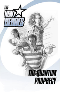
![]() My publisher, HarperCollins, has a team of extremely talented graphic designers, and - once we'd all agreed that
the series title would be The New Heroes - one of the designers came up with this idea for the logo:
My publisher, HarperCollins, has a team of extremely talented graphic designers, and - once we'd all agreed that
the series title would be The New Heroes - one of the designers came up with this idea for the logo:
 A copy of the (almost) final manuscript was then sent out to top comics artist
John Higgins.
(John has been a great supporter of the book from the very beginning: he was the first person - apart from
Leonia - to read the first draft!). John provided this incredible sketch of Danny, Renata and Colin...
(click here to see a larger version!).
A copy of the (almost) final manuscript was then sent out to top comics artist
John Higgins.
(John has been a great supporter of the book from the very beginning: he was the first person - apart from
Leonia - to read the first draft!). John provided this incredible sketch of Danny, Renata and Colin...
(click here to see a larger version!).
Unfortunately, much as we all loved John's sketch, it didn't ring the right bells with the right people at HarperCollins: they wanted something that had less of a "comic-book feel", so it was back to the drawing board!
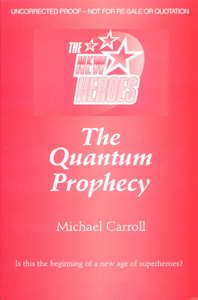 In the meantime, an "uncorrected proof" copy of the book was prepared. Since the cover image wasn't ready
(they rarely are, for the uncorrected proofs), this cover was quickly put together. And yes, it's pink!
Not exactly the sort of colour one would usually associate with superheroes!
In the meantime, an "uncorrected proof" copy of the book was prepared. Since the cover image wasn't ready
(they rarely are, for the uncorrected proofs), this cover was quickly put together. And yes, it's pink!
Not exactly the sort of colour one would usually associate with superheroes!
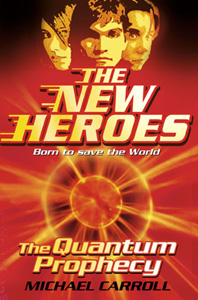 Then one of HC's expert designers came up with this image... The glowing orb in the centre represents
a certain piece of spherical machinery from the book (if you don't know what I'm referring to, then
you haven't read the book and so you really shouldn't be reading these pages!). From what I'm told,
this idea was just a sort of "why don't we try something like this?" thing, but it really grabbed
everyone's attention!
Then one of HC's expert designers came up with this image... The glowing orb in the centre represents
a certain piece of spherical machinery from the book (if you don't know what I'm referring to, then
you haven't read the book and so you really shouldn't be reading these pages!). From what I'm told,
this idea was just a sort of "why don't we try something like this?" thing, but it really grabbed
everyone's attention!
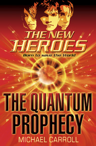 A few adjustments later, and we had the final cover...
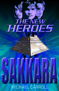 And just for the heck of it, here's a fake cover I made for the second book...!
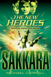
As you'll see from below, the final version of Book 2's cover is a lot better than
mine!
And just for the heck of it, here's a fake cover I made for the second book...!
As you'll see from below, the final version of Book 2's cover is a lot better than
mine!
I also created a couple of covers for Book 3, Absolute Power, but I'll wait a while before posting them here, because one of them is a major spoiler for an important event in the book...